Theming
ADP Component styles can be customized by targeting each element inside the component which gives flexibility to developers to apply their custom themes from any project.
ADP Components
ADP Components are web components created from StencilJS project and enables shadow dom feature making the component not effected by most of outside styles.
What is Web Components?
Web Components are a set of native browser technologies that allow developers to create reusable, encapsulated, and modular custom elements for web applications. They provide a standardized way to build and use UI components across different frameworks, libraries, or even vanilla JavaScript, ensuring better reusability and maintainability.
What is Shadow DOM?
The Shadow DOM is a web standard that allows developers to encapsulate a component's structure, style, and behavior, preventing it from being affected by styles or scripts outside the component and vice versa. It is part of the Web Components specification.
How to style
Developers can target each element inside the components using part:: selector in CSS.
lets consider our imaginary custom-element has the following structure.
<div part="custom-element">
  <div part="custom-element-header"></div>

  <div part="custom-element-body">
    <p part="custom-element-number"></p>
  </div>

  <div part="custom-element-footer"></div>
</div>
Custom styling example.
<style>
  part(custom-element-header) {
    color: yellow !important;
  }

  #red::part(custom-element-header) {
    color: red !important;
  }

  .green::part(custom-element-header) {
    color: green !important;
  }
</style>

<body>
  <custom-element></custom-element>
  <custom-element id="red"></custom-element>
  <custom-element class="green"></custom-element>
  <custom-element class="green"></custom-element>
</body>
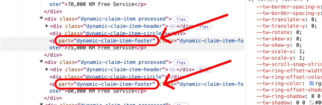
How to find part names
Developers can find parts in 2 ways
- Each Component in their dedicated documentation has Structure section where their structure is showed similar to the above structure.
- Developers can explore the components and find out what is each element part names using browser devtools, as showed in the bellow image.
Next Steps
- Read to the Component List for detailed documentation.